Hi all, just thought i would share this with you.
I put this in a competion , didnt win ,gess i need to improve my work.
any thoughts on how to better this .
Thanks Ralph
Comp pic
-
pugman 1
- Captain
- Posts: 1555
- Joined: 21 May 2009, 19:26
- Type the number ten into the box: 0
- Location: Germany
Comp pic
- Attachments
-
-
Steinie

- Captain
- Posts: 2958
- Joined: 21 May 2009, 17:38
- Type the number ten into the box: 10
Re: Comp pic
Hi Ralph!
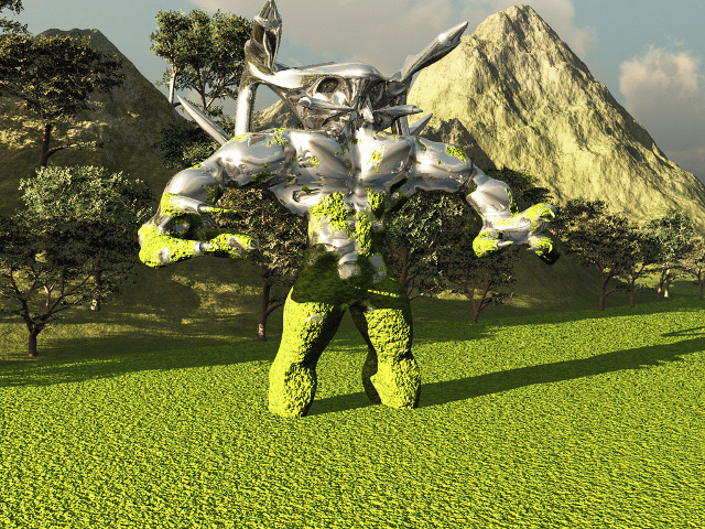
I would try to improve these areas.
The grass needs more variation using height
changes or in the texture.
The Mountain should have better textures. It looks featureless..
The Alien needs more pronounced definition in his features. The feet are
blunt and boring. Also try to work on the head more. I cannot tell if it has eye for instance.
Are those weapons on his head? Put more detail into the features and a better stance would help
to make this a much better work.
The trees look too big on the mountain. Also try to either use more trees or less so that the focus is
on the Alien rather then the background. The two trees right behind the Alien give it a cluttered look.
So by using more trees it becomes a forest and less trees you place them on the mountain so you do not
draw the viewer's attention to them rather than the Alien.
Try to have the trees and mountains get smaller the further back they are to better show distance. You have bigger trees and mountains
toward the back.
The lighting shadows are a little too low and harsh.
Finally give the Alien a better pose!!! It doesn't look like it is ready to do anything. Will it run? Walk? Attack? Sleep? ( )
)
I hope that gives you some useful feedback from one person's opinion.
I'm glad your back showing your stuff again!!
I would try to improve these areas.
The grass needs more variation using height
changes or in the texture.
The Mountain should have better textures. It looks featureless..
The Alien needs more pronounced definition in his features. The feet are
blunt and boring. Also try to work on the head more. I cannot tell if it has eye for instance.
Are those weapons on his head? Put more detail into the features and a better stance would help
to make this a much better work.
The trees look too big on the mountain. Also try to either use more trees or less so that the focus is
on the Alien rather then the background. The two trees right behind the Alien give it a cluttered look.
So by using more trees it becomes a forest and less trees you place them on the mountain so you do not
draw the viewer's attention to them rather than the Alien.
Try to have the trees and mountains get smaller the further back they are to better show distance. You have bigger trees and mountains
toward the back.
The lighting shadows are a little too low and harsh.
Finally give the Alien a better pose!!! It doesn't look like it is ready to do anything. Will it run? Walk? Attack? Sleep? (
)I hope that gives you some useful feedback from one person's opinion.
I'm glad your back showing your stuff again!!
-
pugman 1
- Captain
- Posts: 1555
- Joined: 21 May 2009, 19:26
- Type the number ten into the box: 0
- Location: Germany
Re: Comp pic
Thanks steinie, i made this so he has risen up from the swamp
i know the eays are not good i have a prob with making them
as for the rest ,i will play
i know the eays are not good i have a prob with making them
as for the rest ,i will play
-
MikomDude

- Captain
- Posts: 1930
- Joined: 04 Oct 2010, 11:12
- Type the number ten into the box: 0
- Location: The Hague, Netherlands
Re: Comp pic
I think the main problem is that you just can't really see the alien that well. First of all, you should change your render perspective, at least if you are going to keep that silver/shiny material. It's just that it is to well camouflaged 
Also, if it is a swamp, you should add some open spots in the green... goo there you can actually see the water, maybe add a reflection of the alien in the water for a better effect.
The idea is nice but the alien just needs some more work, maybe a material change of the face of the alien will bring out it's features, I don't know. You should experiment a little
Also, if it is a swamp, you should add some open spots in the green... goo there you can actually see the water, maybe add a reflection of the alien in the water for a better effect.
The idea is nice but the alien just needs some more work, maybe a material change of the face of the alien will bring out it's features, I don't know. You should experiment a little
-
pugman 1
- Captain
- Posts: 1555
- Joined: 21 May 2009, 19:26
- Type the number ten into the box: 0
- Location: Germany
Re: Comp pic
WOW i asked and i got. ok
-
nigec

- Master Chief Petty Officer
- Posts: 561
- Joined: 21 May 2009, 18:46
Re: Comp pic
Its just to green and squeaky clean for me.
IF I'd of modeled the character and like Steinie said the legs look plain I'd stick him up to his knees or deeper in a swamp, maybe use something like Ivy generator to get weeds dangling off him, when people wade through water you'd get a similar type of pose
Even drop the character in a pond of water in blender to get a nice water mesh
Maybe some fog or something and generally just make it dark and sinister looking
You can always make his eyes glow too!
IF I'd of modeled the character and like Steinie said the legs look plain I'd stick him up to his knees or deeper in a swamp, maybe use something like Ivy generator to get weeds dangling off him, when people wade through water you'd get a similar type of pose
Even drop the character in a pond of water in blender to get a nice water mesh
Maybe some fog or something and generally just make it dark and sinister looking
You can always make his eyes glow too!