The guardian 2

User avatar
marcel
Captain
Posts: 2247
Joined: 21 May 2009, 19:52
Type the number ten into the box: 0
Location: paris - France

The guardian 2

Post by marcel »

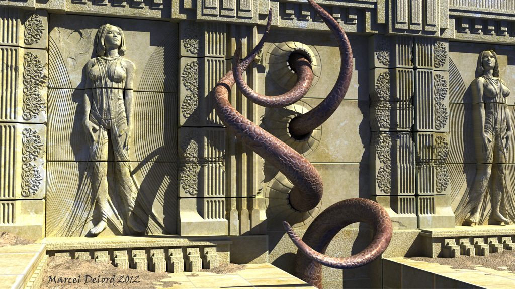
I finally made ​​some improvement. I did not like the top of the wall. Columns wore nothing. It is better not to see the end of the wall. I also added a pattern on the tentacles as suggested by Finis. This leaves less doubt about the animal aspect of the matter but it must remain unreal.

Thank you for constructive comments that encourage me to improve this image. :)
Attachments
bas_relief.jpg
Design - illustration - Animation
http://www.crea-vision.fr
froo
Captain
Posts: 2554
Joined: 22 May 2009, 12:13

Re: The guardian 2

Post by froo »

Looks kinda scary... I sure wouldn't get too close!

Like it, Marcel! :D
User avatar
Finis
Captain
Posts: 5410
Joined: 21 May 2009, 18:26
Type the number ten into the box: 0
Location: America!

Re: The guardian 2

Post by Finis »

This tentacle bump lets the viewer would wonder if the tentacles are stone or flesh. The color does too. It could be old paint. The viewer's imagination can invent ideas. Animal? Statue? Magically animated carving? Ancient machine?

The top of the wall, the added details at the bottom, and sand pile colors do improve the image IMO but the old one gave focus to the guardian area with its arch. The simplicity of the old wall gave the impression that it was old and abandoned and parts were missing or unfinished. That would mean the guardian is very old or generations of its kind have lived here. The new image gives the impression that the temple is more recent to the viewer's time.

The three tall vertical parts just left of the guardian and off center placement of the tentacle portals break the symmetry of the wall. Good.

I like that the goddess' feet aren't on the ground. Floating seems symbolic of divine or supernatural aspects.
I prefer dangerous freedom over peaceful servitude. -- Thomas Jefferson/Jean Jacques Rousseau
darkmage
Senior Chief Petty Officer
Posts: 184
Joined: 03 Apr 2011, 13:42
Type the number ten into the box: 9

Re: The guardian 2

Post by darkmage »

great!!!!!!!
User avatar
marcel
Captain
Posts: 2247
Joined: 21 May 2009, 19:52
Type the number ten into the box: 0
Location: paris - France

Re: The guardian 2

Post by marcel »

Thanks for the comments.

@ Froo :
scary and intriguing without effect too easy (hemoglobin). Beauty attracts like a trap. :)

@ Finis :
This is a constructive comment ! :bananacheers:
I thought primarily to aesthetics to complete the image. The recessed portion of the top of the wall did not suit me and I wanted the wall leaves appear nothing beyond, as if to say "stop". The top of the wall seems recent and contrast with the wear column. So this is not just a ruin, but a living temple forever. For the tentacles, I wanted something more animal but more discreet. The colors were too kitsch. but it remains unclear about the nature of the animal.
Of course, as you suggest, there could be more questions, but I prefer to keep some for another image eventually. The appearance of a mix of stone / gold / organic is interesting and I see further: imagine an organic material that turns into stone and gold gradually following form. This would give a notion of time showing the steps of the transformation.

@ Darkmage :
I do what I can, but it's fun to do. :)
Design - illustration - Animation
http://www.crea-vision.fr

Return to “Finished ArtWork”