Do me a favour please guys,
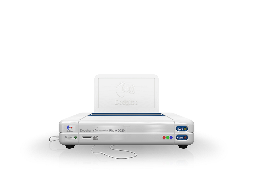
Take a look at this render, does it look to bright to you?
It looks fine to me but I've a friend that insists it's too bright and washed out.
So I though who better to ask than a forum full of artists.
Cheers
ATB
Steve
Is this too BRIGHT????
-
Mad Mouse

- Chief Petty Officer
- Posts: 86
- Joined: 22 May 2009, 21:29
- Type the number ten into the box: 0
- Location: Kent UK
Is this too BRIGHT????
- Attachments
-


...Never miss a good chance to shut the hell up...
-
Steinie

- Captain
- Posts: 2958
- Joined: 21 May 2009, 17:38
- Type the number ten into the box: 10
Re: Is this too BRIGHT????
The body looks good but the screen is slightly too bright for me.
-
Prodigy

- Site Admin
- Posts: 957
- Joined: 21 May 2009, 14:46
- Type the number ten into the box: 0
- Location: Uruguay
Re: Is this too BRIGHT????
Too bright for me.. can i suggest you something? use a white to gray gradient for the background.. that should help..
๑۩۞۩๑ prodigy ๑۩۞۩๑
-
LeonRegis

- Captain
- Posts: 1946
- Joined: 18 Aug 2009, 17:36
- Type the number ten into the box: 0
- Location: Brazil/Earth/Orion Arm/Milky Way/4th Dimension/This Universe/Multiverse???/Singularity???
Re: Is this too BRIGHT????
The screen is just a little... I think because of the background, but I'm not sure.
HTH
HTH
Be the change you want to see in the world. - Mohandas Gandhi
-
Finis

- Captain
- Posts: 5410
- Joined: 21 May 2009, 18:26
- Type the number ten into the box: 0
- Location: America!
Re: Is this too BRIGHT????
The printer looks ok to me but the background needs something. The background is what makes the picture bright. Maybe the gradient Prodigy recommended.
I prefer dangerous freedom over peaceful servitude. -- Thomas Jefferson/Jean Jacques Rousseau
-
RAYMAN

- Captain
- Posts: 2547
- Joined: 21 May 2009, 18:56
Re: Is this too BRIGHT????
It depends on what statement you want to make white on white can be a statement.
Try to underline that somehow if you use it
here is a render that i made with a grey gradient if that is what you want...... then a circular gradient could be better then a linear one
but pure white can be the way to go if you want that...
Its the floating of the object I would change ...
try to put it onto a shiny white surface and readjust the composition.
Peter
Try to underline that somehow if you use it
here is a render that i made with a grey gradient if that is what you want...... then a circular gradient could be better then a linear one
but pure white can be the way to go if you want that...
Its the floating of the object I would change ...
try to put it onto a shiny white surface and readjust the composition.
Peter
- Attachments
-
-
i.phaedrus

- Petty Officer Third Class
- Posts: 13
- Joined: 04 Nov 2009, 21:03
- Type the number ten into the box: 0
Re: Is this too BRIGHT????
i agree with prodigy & rayman. too much white, imo... also, the gradient circle seems like an off shadow or something, but the object does not apear to be grounded. apple design trend was to have a slight reflection with an alpha gradient fading the reflection out... minimalistic design, but the reflection keeps the object grounded.
nice printer design though.
phae
nice printer design though.
phae
-
marcel

- Captain
- Posts: 2247
- Joined: 21 May 2009, 19:52
- Type the number ten into the box: 0
- Location: paris - France
Re: Is this too BRIGHT????
The printer is too dark for me. Use contrast with the background. If the background is grey, you can have a pure white on the model. Maybe a little more light again on the face with buttons in this test. These kind of picture need to be very light but only when the picture is big. Not good for small image (see apple advertising).
- Attachments
-
Design - illustration - Animation
http://www.crea-vision.fr
http://www.crea-vision.fr
-
Johny

- Petty Officer First Class
- Posts: 53
- Joined: 21 May 2009, 17:14
Re: Is this too BRIGHT????
Its too bright on my monitor too.
How about some renderer with different light intensity value, and let us choose with one its better on our monitor?
How about some renderer with different light intensity value, and let us choose with one its better on our monitor?
-
v3rd3
- Lieutenant Commander
- Posts: 1191
- Joined: 21 May 2009, 20:04
Re: Is this too BRIGHT????
Even the little bit of shadow Marcel recommends makes the image less overpowering.
The only issue I had with the original image was there was not enough contrast between the object and its background to easily delineate the object. As was stated earlier the brightness in the image is really a matter of what you are trying to accomplish. Bright is fine but not at the expense of washing out the object you are trying to portray.
Nice job on the printer BTW....
The only issue I had with the original image was there was not enough contrast between the object and its background to easily delineate the object. As was stated earlier the brightness in the image is really a matter of what you are trying to accomplish. Bright is fine but not at the expense of washing out the object you are trying to portray.
Nice job on the printer BTW....
-
Tommy

- Master Chief Petty Officer
- Posts: 403
- Joined: 28 Jun 2009, 14:05
- Type the number ten into the box: 0
- Location: Sweden, Göteborg
Re: Is this too BRIGHT????
The image Marcel posted improves the picture. There is not much that you have to ad to get the picture clearer. One thing I'm thinking of is the cord which is under the front. Maybee it shouldn't be there. I find it a little distracting. It's only my opinion.
Otherwhise the you could try sell the printerdesign to MAC with some small changes.
Otherwhise the you could try sell the printerdesign to MAC with some small changes.
"Carpe diem"
-
Steve

- Master Chief Petty Officer
- Posts: 394
- Joined: 29 Jun 2009, 10:20
- Type the number ten into the box: 0
- Location: Hiding (Like a ninja)
Re: Is this too BRIGHT????
I must admit the object does get a bit washed out, the image is a little over-exposed, higher contrast maybe?
-
Wigand
- Senior Chief Petty Officer
- Posts: 204
- Joined: 21 May 2009, 17:38
Re: Is this too BRIGHT????
First thing I thought:
Is this the printer heaven?
Maybe it helps to use lights from the side, to get more shadows. Then it would be
easier to read the relief text on the paperholder.
The reflectances on the front look like scratches even in higher resolution.
The text linemaster PHOTO should not have reflectance. I miss a little colour in
the reflectances. Maybe blue.
Is this the printer heaven?
Maybe it helps to use lights from the side, to get more shadows. Then it would be
easier to read the relief text on the paperholder.
The reflectances on the front look like scratches even in higher resolution.
The text linemaster PHOTO should not have reflectance. I miss a little colour in
the reflectances. Maybe blue.
-
Mad Mouse
- Chief Petty Officer
- Posts: 86
- Joined: 22 May 2009, 21:29
- Type the number ten into the box: 0
- Location: Kent UK
Re: Is this too BRIGHT????
Thanks guys,
I knew I could rely on you.
Ideally I would of used a graduated background as Prodigy suggested or maybe something like Marcel's idea
but because of how this image is planned to be used, neither would be suitable. All will be revealed when I
show you the finished work.
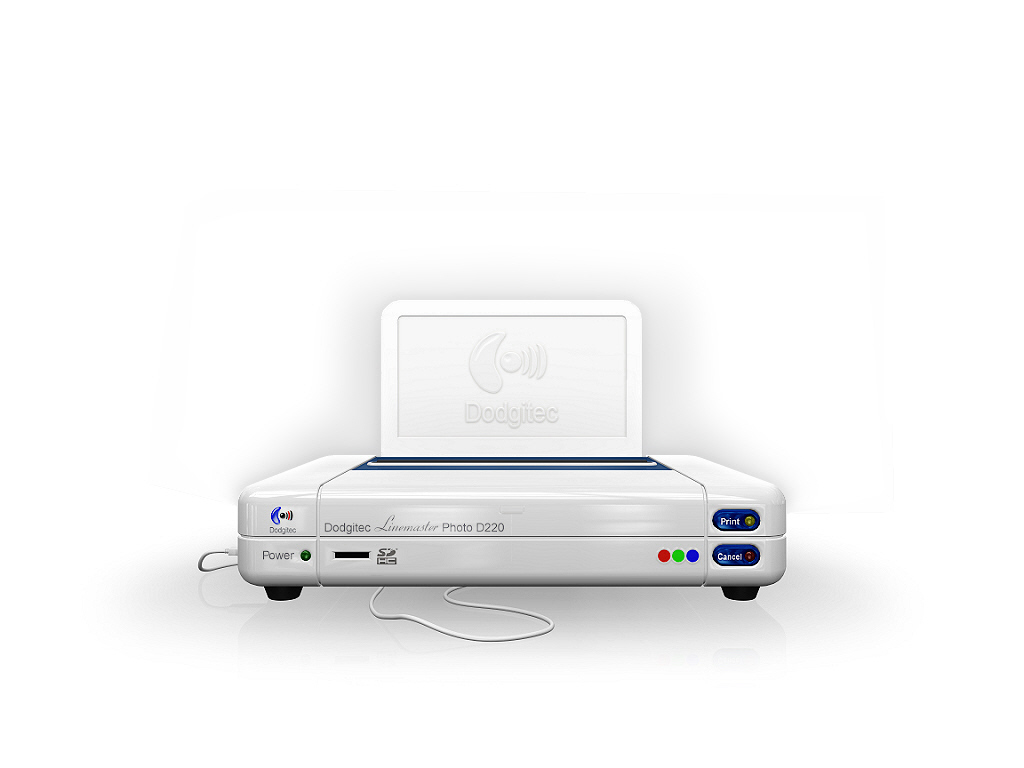
Sooooo... I've decided to go with this... I think the tinted background helps make the white, whiter.
What do you think? Is that better?
Cheers
ATB
Steve
I knew I could rely on you.
Ideally I would of used a graduated background as Prodigy suggested or maybe something like Marcel's idea
but because of how this image is planned to be used, neither would be suitable. All will be revealed when I
show you the finished work.
Sooooo... I've decided to go with this... I think the tinted background helps make the white, whiter.
What do you think? Is that better?
Cheers
ATB
Steve
- Attachments
-

...Never miss a good chance to shut the hell up...
-
Steve
- Master Chief Petty Officer
- Posts: 394
- Joined: 29 Jun 2009, 10:20
- Type the number ten into the box: 0
- Location: Hiding (Like a ninja)
Re: Is this too BRIGHT????
Much better, but the logo on the back face of the object makes my eyes adjust constantly, maybe that needs to be a bit clearer?
-
LeonRegis
- Captain
- Posts: 1946
- Joined: 18 Aug 2009, 17:36
- Type the number ten into the box: 0
- Location: Brazil/Earth/Orion Arm/Milky Way/4th Dimension/This Universe/Multiverse???/Singularity???
Re: Is this too BRIGHT????
Much better, but the logo on the back face of the object makes my eyes adjust constantly, maybe that needs to be a bit clearer? ²
Be the change you want to see in the world. - Mohandas Gandhi
-
Steinie
- Captain
- Posts: 2958
- Joined: 21 May 2009, 17:38
- Type the number ten into the box: 10
Re: Is this too BRIGHT????
That was my original complaint too. NOW they notice... 
-
marcel
- Captain
- Posts: 2247
- Joined: 21 May 2009, 19:52
- Type the number ten into the box: 0
- Location: paris - France
Re: Is this too BRIGHT????
--- or the bump logo darker?
sure a grey background help to show a white object but I prefer just a little shadow around the printer and keep the background white. It depend of the use of the image...
sure a grey background help to show a white object but I prefer just a little shadow around the printer and keep the background white. It depend of the use of the image...
Design - illustration - Animation
http://www.crea-vision.fr
http://www.crea-vision.fr
-
Mad Mouse
- Chief Petty Officer
- Posts: 86
- Joined: 22 May 2009, 21:29
- Type the number ten into the box: 0
- Location: Kent UK
Re: Is this too BRIGHT????
Thanks guys,
I think the problem with the logo at the back is more down to the resizing to post here
and I doubt it will be a problem when finished.
ATB
Steve
I think the problem with the logo at the back is more down to the resizing to post here
and I doubt it will be a problem when finished.
ATB
Steve
...Never miss a good chance to shut the hell up...
-
LeonRegis
- Captain
- Posts: 1946
- Joined: 18 Aug 2009, 17:36
- Type the number ten into the box: 0
- Location: Brazil/Earth/Orion Arm/Milky Way/4th Dimension/This Universe/Multiverse???/Singularity???
Re: Is this too BRIGHT????
Cool, good luck with it! 
Be the change you want to see in the world. - Mohandas Gandhi
-
Tommy
- Master Chief Petty Officer
- Posts: 403
- Joined: 28 Jun 2009, 14:05
- Type the number ten into the box: 0
- Location: Sweden, Göteborg
Re: Is this too BRIGHT????
Much better. I like the small reflection underneath. The printer has got an enviroment thats good to the image.
The background, as Marcel wrote, depend on how you are using the image.
The background, as Marcel wrote, depend on how you are using the image.
"Carpe diem"
-
v3rd3
- Lieutenant Commander
- Posts: 1191
- Joined: 21 May 2009, 20:04
Re: Is this too BRIGHT????
Looks great Mouse....